Thanks for looking!
Tuesday, April 29, 2014
Layout using the Scraps of Darkness April Kit
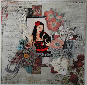
I just love the latest kit from Scraps of Darkness called the His & Hers kit. So much vintage lusciousness! I used the latest sketch that comes in printed form with the kit. I like to use the sketch to warm up, then I take off on my own with the rest of the kit. I used a photo of my daughter in this layout. SOD is currently running a sketch challenge on their Facebook page for a chance to win a $20 store credit!
Monday, April 28, 2014
Altered Stage - Reach For The Stars
I had so much fun decorating this Stage by Gina's Designs. I love anything to do with the sky, stars, moon and all things celestial, so I thought I'd call my creation "Reach For The Stars". I added lots of textures to this piece with chunky glitter, glass beads, bead gel, shabby embossing powders, mica, gilder's paste, etc.
Gina's Designs Products Used:
Monday, April 21, 2014
Shuttered Window Frame in a Vintage Beach Design
Hi Everyone! Today I'm sharing this shuttered window frame by Gina's Designs. This gorgeous piece is so versatile, and can be decorated to go with anyone's decor and style. I decided to decorate mine in a vintage beach theme with old family photos of my Mom, Brother, and Myself. We spent most of our Summer days at Crane's Beach in Ipswich, MA. The memories are among my favorite from my childhood. I tried to invoke those feelings of tranquility when I created this, and to recreate the scene as I remember it. Thanks for looking!
Wednesday, April 16, 2014
Sunny Forever and Ever....Once Upon A Sketch April Challenge
Today I'm sharing my entry to the Once Upon A Sketch Challenge for April. The journaling theme this month is "An event that changed my life......" I chose to scrap about my move from Boston to San Diego in the 80's. I moved on the spur of the moment following a big snow storm. I actually read a magazine article about San Diego entitled "Sunny today, sunny tomorrow, sunny forever and ever." I was going through a major change in my life, and just decided to buy a ticket and go. I hopped aboard a Delta and never looked back. I was trying to show the one half of the layout as white and wintery, bleak and cold, and then move into the sunshine. It was a real challenge for me, but then again so was the move! Hope you like it!
Below is the sketch:
My take on the sketch:
A 12 x 12 Altered Frame in a steampunk style
Hi everyone! Today I'm sharing my version of the Wall Art Key from Gina's Designs. The keys come in 3 styles. I chose the Hot Air Balloon style for my project. I decided to mount my key on the edge of a 12 x 12 unfinished wooden photo frame that I purchased at Michael's. I had so much fun decorating this. I did a lot of stenciling, stamping and doodling all over the frame, then I backed the key with paper before mounting it to the side. I couldn't decide on the right photo to put inside the frame so I added our steampunk lady chipboard shape in the area where the photo goes. It was supposed to be temporary, but now I like it so much that I might leave it just as is.
Gina's Designs Products Used:
Saturday, April 12, 2014
When Life Hands You Lemons......A Scraps of Darkness kit club creation
I took this photo of my backyard lemons. It was perfect for some of the papers in the Scraps of Darkness March kit Radioactive. I've been handed more than my share of lemons in recent weeks (in more ways than one) and in the past week I decided to laugh it off and move on, a great weight off my shoulders. I loved working with the bright colors in this kit!
Friday, April 11, 2014
Wall Art - DT Project Ephemera's Vintage Graden
This Altered Wall Art piece is a Design Team project for Ephemera's Vintage Garden. I began with a 12 x 12 unfinished frame from Michael's, and some collage style digital papers from the Shabby Chic Mashup paper add-on. It's a set of 8 printable double-sided pages designed for 4 x 6 mini journals. They are a "mashup" of several other designs in Debbie's current digital minis line, and were designed to coordinate with other collections. It just so happens that 6 of these pages will fit perfectly in a 12 x 12 frame. I love that there is plenty of space around the frame to decorate as I didn't want to take too much away from the designs, the papers are so pretty.
Once I had the frame finished with stenciling, stamping and misting, I used Mod Podge to adhere the papers to the back of the frame. I then framed each "section" with a tiny lace trim, giving almost a shadowbox effect. I decorated the sections with bits of this 'n that, mostly whatever was handy and fit with the theme. I layered my embellishments for dimension, further adding to a shadowbox effect.
Working with digital papers is amazing because you can print them out as many times as you'd like. It's a great opportunity to have matching projects to decorate your space with. I will be covering a jewelry box next. If you scroll down to the labels section at the right margin you can find my other projeects I have made with this same collection. Head over to Ephemera's Vintage Garden, to check out the gorgeous papers, and sign up for some amazing freebies HERE!
Other Products Used:
Diamond patterned texture sheet on the frame, small dressform, and doily by Gina's Designs
Butterflies by Renea Bouquests on Etsy
Most embellishment die cuts by Kaisercraft, Prima, and Creative Imaginations
Tuesday, April 8, 2014
Weekend Fun - Scraps of Darkness
More fun with the March kit from Scraps of Darkness called Radioactive. This kit has really encouraged me to try new things. It's such a fun kit. The photos are my DD and friend, always having fun and providing me with lots of photos lately.
Monday, April 7, 2014
Sketch Challenge at Gina's Designs and a Layout
Each month, on the first Monday, a new sketch will be provided in the gallery. Winner receives a $10 gift certificate to shop at Gina's Designs.
You must register on the gallery in order to upload, and your entry must be entered into the area of the gallery designated for sketch challenges, and in the proper month. Winners will be chosen by drawing from all eligible projects and will be announced on the blog on the second Monday of each month. We encourage you to use Gina's Designs products in your project but it is not required to be eligible to win.
My sample entry below features my cat Willie caught in the act of adjusting the space heater.
Gina's Designs Products Used:
Sunday, April 6, 2014
Mixed Media 12 x 12 Scrapbook Layout
Lately I've been stepping out of comfort zones and trying new things. I'm really interested in layers and mixed media techniques on scrapbook layouts. I've seen some amazing artistic pieces. On a recent mini album I created, I had a photo left over that I had inadvertently printed too large for the mini album so I thought I'd use the photo for practice. I was going for a natural outdoorsy effect, and most importantly I've tried to create some depth. I've noticed many of my attempts at mixed media have lacked depth of texture and color. I plan to keep working at it.
I used a lot of old stash to experiment with, and naturally some of Gina's Designs chipboard shapes including some new pieces that I just love which I will list below. The ferns, flower and leaves are some older die cuts probably by K and Company. I rolled them around with an embossing tool to give them some shape and texture. I thought they came out pretty good actually, considering that they started out flat. Also I used a lot of stamps, inks, gesso etc., burlap, and of course washi tape, one of my new favorite embellishments.
Products Used:
Gina's Design's Chipboard Shapes
A Moment in Time (Words & Phrases 1)
Photo Reel Miniatures
Art Deco Corners
Mambi Design paper
Tim Holtz Distress Ink
Dylusions Stencils
Tim Holtz Stencils
Butterflies by Renea Bouquets on ETSY
Pet Memorial Mini Album for Kathryn's Scrappers
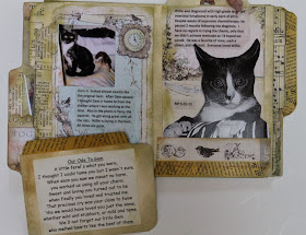
I created this mini album for a challenge at Kathryn's Scrappers Facebook Group. I had been meaning to create something like this for a long time in the memory of my dearly departed fur kids. The challenge was to create a mini following a tutorial that uses 3 tabbed file folders. It was really fun to make, very simple, and fits a lot of photos. The tutorial was done as more of an art journal than a mini album, so I might just need to try it again. The tutorial I used can be found HERE.
I have used several random bits and pieces from my coveted stash of Gina's Designs chipboard shapes on the cover of this mini album, and used Prima's Pixie Glen design paper. Thanks for looking!


